Last Updated :
January 27, 2025
Supriya Sarkar

A comprehensive guide to Gantt Charts: Templates, tools, and effective presentation

Create a Gantt chart using our free Gantt chart templates to streamline your project management.
girl explaining gantt chart

If you’re involved in project planning, chances are you’ve come across Gantt charts. While they might initially seem complex, understanding them can unlock their full potential, helping you save time, cut costs, and streamline project workflows. Invented by Henry Gantt, a mechanical engineer, back in the early 1900s, this bar chart-based tool has stood the test of time and remains a go-to resource for modern project managers, helping teams easily plan and execute projects.

In this guide, we’ll walk you through everything you need to know about creating and presenting Gantt charts. These powerful tools help teams visualize project timelines, track progress, and manage tasks effectively, even for complex projects with multiple interdependencies.

What is a Gantt Chart?

A Gantt chart is a highly effective project management tool that simplifies planning and execution by providing a clear visual representation of your project schedule. It’s especially valuable for projects with intricate interdependencies across teams and tasks.

Breaking down a project into a list of activities with clear timelines and assigned responsibilities transforms complex workflows into actionable plans, streamlining project planning and ensuring smoother execution.

Key benefits of Gantt Charts:

  1. Streamlined timelines: Gain a clear overview of the entire project timeline from start to finish, ensuring milestones and deadlines are easily trackable.
  2. Enhanced task management: Gantt charts help with resource management, task assignment, actual progress monitoring, and adapting to changes efficiently.
  3. Improved collaboration: Foster better team alignment with real time updates using tools like online Gantt chart software.

Why Gantt charts matter in complex projects:
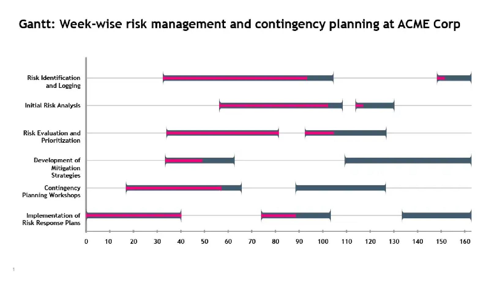
Imagine managing a product launch involving multiple teams responsible for design, marketing, and distribution. A Gantt chart ensures every team understands their tasks and deadlines while showing how their work impacts others. This clarity prevents delays and keeps the project on track.

How does the Gantt chart diagram work for project teams?

Any project has distinct phases: initiation, planning, execution, monitoring, and closing. The Gantt chart plays a pivotal role during the planning phase, where the project schedule is created. This schedule outlines key details, including project activities, durations, dependencies, resources, and milestones. These details must be communicated effectively to the teams responsible for carrying out the tasks.

Let’s make it simple. A Gantt chart is essentially a bar chart used to report team progress and track tasks. It is divided into two key sections:

  1. The left side: A grid that lists project tasks along with key details like task owners, deadlines, and resource requirements.
  2. The right side: A timeline that visually represents tasks using horizontal bars, showing their start and end dates.

Now that we understand how to read a Gantt chart let’s explore how it works in action:

  • Taskbars and progress tracking: Each task is shown as a horizontal bar stretching from its start to its end date, representing its duration. As work progresses, the bar fills up to show how much of the task has been completed.
  • Dependence: Some tasks depend on others to start or finish. Lines connecting the taskbars illustrate these relationships, making dependencies easy to spot.
  • Milestones: Milestones mark important moments in the project and typically have no duration. They’re usually represented by distinctive symbols like gold or yellow diamonds.

How to create a Gantt chart for your project plan?

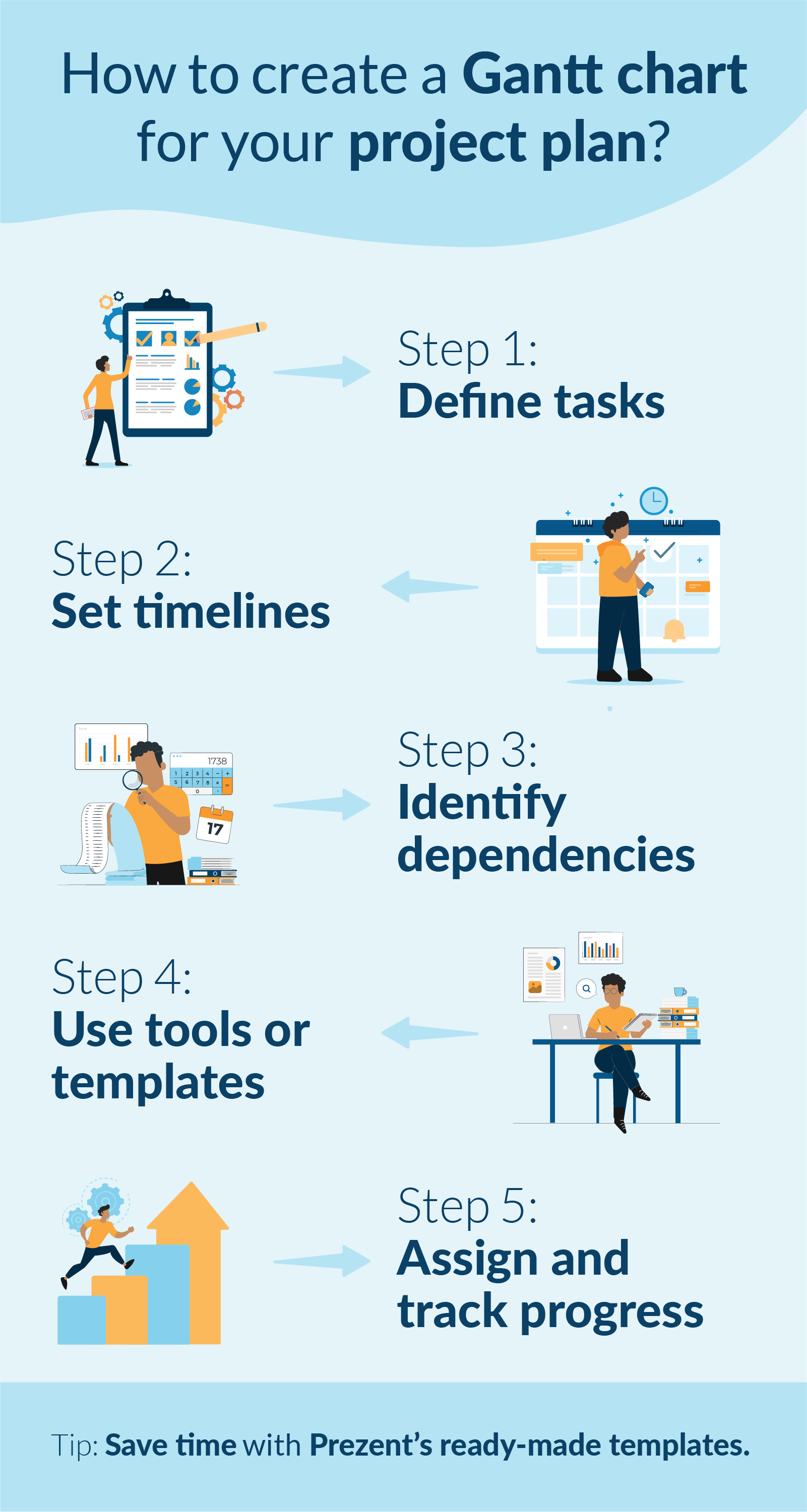
Creating a Gantt chart doesn’t have to be overwhelming. Let’s break it down using the example of a software development project to make it easy to follow:

1. Define tasks for project teams:

Start by listing all the tasks required for the project. For our software development example, the key tasks might include:

  • Requirement gathering
  • UI/UX design
  • Coding
  • Quality testing
  • Deployment

2. Set timelines:

Determine the timeline for each task by assigning specific start and end dates. For instance:

  • Requirement gathering: Jan 1 – Jan 7
  • UI/UX design: Jan 8 – Jan 21
  • Coding: Jan 22 – Feb 28
  • Quality testing: Mar 1 – Mar 14
  • Deployment: Mar 15 – Mar 20

3. Identify dependencies:

Note tasks that depend on the completion of others. In our example:

  • Coding can only begin once UI/UX design is complete.
  • Quality testing depends on the completion of coding.

4. Use a Gantt chart software, template, or Excel:

Input your task list, start and end dates, and dependencies into a Gantt chart tool like Excel, Microsoft Project, templates, or an online Gantt chart generator.

  • For Excel: Create a table for tasks and timelines and use a stacked bar chart to visualize the schedule.
  • For an online tool: Drag and drop your tasks onto the timeline for a clear, visual overview.

5. Collaborate, assign tasks, and monitor progress:

Allocate responsibilities to team members and use the chart to track progress. For example, assign the coding phase to the development team and the quality testing phase to QA specialists.

As tasks are completed, update the chart to show progress and keep everyone aligned on what’s next.

Simplify project management presentations- Free Gantt chart templates

As seen in the earlier example of a software development project, Gantt chart presentations provide the entire team with a clear and actionable visual of the project timeline. These presentations illustrate:

  • When coding begins: Tied directly to the completion of the design phase.
  • Where QA testing overlaps with coding: Ensuring a seamless process and timely delivery.
  • How each task fits into the overall project plan: Offering a cohesive view of task relationships and dependencies.

Regularly updating and presenting Gantt charts is crucial for fostering:

  • Transparency: Keeping all stakeholders informed about progress and potential challenges.
  • Accountability: Helps to define responsibilities and track task ownership clearly.
  • Coordination: Aligning teams and ensuring smooth collaboration, even for complex projects.

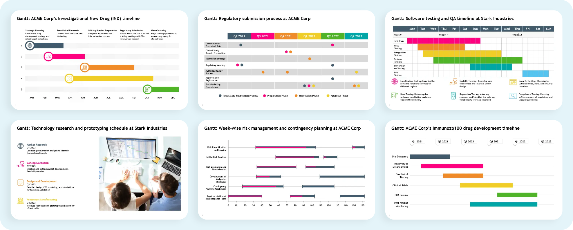
Consider using pre-designed templates like the examples below to simplify Gantt slide creation. These templates allow for quick updates and easy customization, enabling you to create professional Gantt chart slides with minimal effort.

A well-designed Gantt chart does more than just plan projects—it effectively communicates key details, making it easier to manage stakeholder expectations. To maximize impact, keep these best practices in mind:

  • Simplify visuals: Opt for a clean, straightforward Gantt chart format with clear labels and minimal distractions.
  • Highlight milestones: Draw attention to critical deadlines and deliverables to keep the team focused on priorities.
  • Provide context: Clearly explain task dependencies and potential ripple effects of delays on the project timeline.

By following these strategies, your Gantt chart presentations will not only guide project execution but also enhance team alignment and stakeholder confidence.

Make a Gantt chart online with Prezent:

Gantt charts are invaluable for planning, tracking, and presenting project timelines. They offer a clear roadmap for teams to navigate even the most complex workflows. With the right approach, these charts transform daunting schedules into actionable plans that drive transparency, accountability, and seamless collaboration.

Manually creating and maintaining Gantt charts can be tedious and time-consuming, pulling you away from core responsibilities. That’s where Prezent makes a difference. With Prezent, professionals can:

  • Create stunning Gantt charts in minutes: Use ready-made templates tailored for impactful project presentations. Whether you need to showcase milestones, manage dependencies, or track progress, Prezent simplifies the process, letting you focus on delivering results.
  • Ensure brand consistency effortlessly: Maintain 100% brand alignment across all your slides without manual adjustments.
  • Personalize presentations effectively: Tailor your Gantt chart slides to suit your audience, ensuring they resonate and make a lasting impact.
  • Leverage modern Gantt chart features: Auto-create project presentations in minutes, track progress visually, and manage dependencies seamlessly using a simple Gantt chart layout.
  • Facilitate real-time collaboration: Easily collaborate with your team on slides and project presentations, ensuring efficient teamwork and on-time delivery. Also, get real-time feedback on project details without delays.

FAQ's:

1. Can a Gantt chart be used to identify and manage the critical path in a project?

Yes, a Gantt chart is an excellent tool for identifying and managing a project's critical path. By visually representing task sequences and their dependencies, it helps project managers pinpoint tasks that directly impact the project’s timeline, ensuring timely interventions to avoid delays.

2. How can using Gantt charts improve collaboration and communication within a project team?

Gantt charts provide a centralized visual representation of project timelines and responsibilities, fostering transparency. By outlining task dependencies and milestones, they align all team members, improve accountability, and enable real-time updates for better coordination.

3. How can Gantt charts be adapted for agile project management methodologies?

While traditionally used in waterfall methodologies, Gantt charts can be adapted for agile by representing sprints as individual tasks and using flexible timelines. They can also track progress through visual indicators like percentage completion, allowing for iterative updates.

4. What are the challenges of using Gantt charts for large-scale projects, and how can they be addressed?

Challenges include excessive complexity, difficulty in maintaining updates, and visual clutter. These can be addressed by breaking the project into smaller sub-projects, using filters to focus on critical tasks, and leveraging software with automation features to simplify updates.

Take the first step toward streamlined project management and elevate your presentation game. Book a demo today or explore our free trial to experience how Prezent can transform the way you communicate your project timelines and engage stakeholders effortlessly.

Ready to create impactful presentations?

Try for free
No items found.
No items found.

Related resources

BLOG
Supriya Sarkar
April 1, 2026
The best B2B AI tools for enterprise teams: Features, pros and cons, pricing, and use cases
Find the best B2B AI tools for enterprise teams. Evaluate features, pricing, pros and cons, and use cases to choose tools that fit your workflows and deliver measurable impact.
BLOG
Niyati Mahale
April 1, 2026
11 best Genspark AI alternatives I tested for 2026
This guide covers the best Genspark AI alternatives for content, SEO, and presentations. Compare features, pricing, and real-world usability to find the right tool.
BLOG
Supriya Sarkar
April 1, 2026
What is presentation software? A complete guide to how it works, what to look for, and how to choose the right one
What is a presentation software? This guide explains how it works, key features to look for, and how to choose the best presentation software.
BLOG
Supriya Sarkar
March 31, 2026
PopAI review: Complete breakdown of features, pricing, and alternatives
PopAI review: Is this AI tool right for business presentations? Explore features, pricing, limitations, and enterprise alternatives.
BLOG
Niyati Mahale
March 27, 2026
Microsoft Copilot review for presentations: features, pricing & limitations
Explore Microsoft Copilot’s features, pricing, and limitations for presentations. See how it performs and whether it fits your workflow.
BLOG
Niyati Mahale
March 27, 2026
Adobe Review (2026): Is Adobe InDesign Worth It for Business Use?
This Adobe review evaluates Adobe InDesign’s features, pricing, and usability. See how it performs for business workflows and where it falls short.
BLOG
Niyati Mahale
March 27, 2026
Best AI Pitch Deck Generators in 2026 (Tested & Reviewed)
I tested the best AI pitch deck generators to see which tools actually help you build clear, structured, and convincing pitch decks faster.
BLOG
Supriya Sarkar
March 26, 2026
10 Best PopAI alternatives: Compare features, AI capabilities, pricing, and free plans
Find the best PopAI alternatives and AI presentation makers. Compare AI features, pricing, and free plans to create smarter, more professional presentations.
BLOG
Niyati Mahale
March 27, 2026
Best Plus AI Alternatives in 2026: Top 8 AI Presentation Tools
I tested the best Plus AI alternatives to see which tools actually create presentation-ready decks. Here are the top AI presentation tools worth using in 2026.
BLOG
Supriya Sarkar
March 27, 2026
Nano Banana review: Evaluating strengths, workflow gaps, and AI solutions for enterprise presentations
Nano Banana review for enterprise presentations. Explore visual strengths, identify workflow gaps, and see how teams use AI to build faster, executive-ready presentations.
BLOG
Niyati Mahale
March 27, 2026
11 Best SlideShare Alternatives for Sharing Presentations
Explore the best SlideShare alternatives for creating and sharing presentations. Compare tools for hosting, collaboration, design, and presentation analytics.
BLOG
Niyati Mahale
March 23, 2026
Beautiful.ai Review (2026): Features, Pricing, Pros & Cons
An in-depth Beautiful.ai review covering features, pricing, pros, and limitations to help you decide if it’s the right presentation tool for your needs.
Free 14-Day Trial*

Customized On-Boarding*