Last Updated :
January 10, 2023
Jessica Cara

The basics of good presentation design

Take these tips and design fundamentals to create stunning business presentations that attract attention and communicate your ideas clearly.
“Good design is good business.”

Thomas J. Watson, Jr., former IBM president

Great presentation design is a surefire way to capture and keep your audience’s attention during a business presentation. Research shows that the human brain processes visual information 60,000 times faster than text, so your presentation visuals should be used as another opportunity to support and communicate your message.

But not all of us are graphic designers (as much as we’d like to believe we are!), so it can be an easy mistake to distract with our visuals rather than enhance our presentation. Yet with some design fundamentals and basic tips, you can create stunning presentations that attract attention and help communicate your ideas clearly.

The 7 elements of design

Every visual design includes these seven fundamental elements: shape, color, value, space, form, line, and texture.

Graphic designers use these elements of design to create visuals to evoke feelings and convey moods. By understanding these design basics, you can use these elements thoughtfully in your presentations to best support your ideas.

Shape

In their most basic form, shapes are two-dimensional. Graphic artists can combine other elements (like line, color, and value) to give the appearance of a three-dimensional shape. There are three types of shapes:

  • Organic shapes: occur naturally in the world
  • Geometric shapes: angular and mathematically consistent
  • Abstract shapes: depict real-life things but not exact representations (e.g. stick figure represents a person)

Color

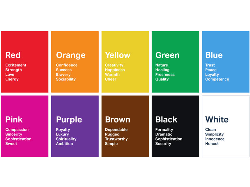
Color can help establish the mood for your presentation. Designers also use the color wheel and color theory to help convey light, depth, and point of view.

Image source

Value

Value (or tone) in design refers to how light or dark design elements appear. Every color shade is arranged on a gradient value scale and has a value between white and black. Designers and artists use value to create the appearance of mass and volume.

Space

Spacing is important because it helps the audience view your design clearly. A slide layout with too little space can be overwhelming to view. There are two types of space to note:

  • White space (or negative space): the space between or around the focal point of an image.
  • Positive space: the space your content (text, visuals) takes up.
Image source

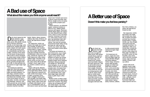
💡 Prezent Pro-Tip: Make sure to leave white space around your company logo (usually placed in the footer of your slides away from text and other visuals).

Form

Form most closely connects with three-dimensional objects, like cubes, spheres, and cylinders. Designers can create the appearance of form on flat surfaces by using light, shadow, negative space, and other design elements to show volume of height, weight, and depth.

Line

Lines—whether horizontal, vertical, or diagonal—help direct your eye toward a certain point in your design. Straight lines add emphasis and drive action, while curved or patterned lines can add texture to your design.

Texture

Texture represents how an object feels or is perceived to feel. Adding visual texture to your slides can effectively set a mood or draw interest to specific points in your presentation. However, be careful to not add too many texture elements in one slide as that can overwhelm the viewer and distract from your message.

“Your slide visuals should support and enhance the single message you’re trying to convey, so don't overdo the 3D forms, lines, or textures in your presentations.”

Emily Branch, Head of Design at Prezent

Tips for using color

How you incorporate color in your presentation design can make a big difference in how your message is received. Too many mismatching colors can be visually distracting or can make the text on your slides difficult to read. Here are some tips to keep in mind when using color in your presentations.

  • Bring in your brand colors. With business presentations, your use of color should reflect your brand. Incorporate your company’s approved color palette or logo throughout your presentation slides.
  • Use tint, tone, and shade. These elements can add depth to a communication point or change the mood of a slide.
  • Follow the 60-30-1 rule. This rule indicates that in your design space, 60% should be a dominant color, 30% a secondary color, and 10% an accent color. Designs that don’t stick to this rule often lead to distracting designs.

Tips for using space

With presentations, it’s better to say more with less. Giving your text and images room to breathe on each slide —possibly using tools like text expanders— allows your audience to focus on the important aspects of your presentation without getting distracted. Here are two quick tips to help you make the best use of space in your slide designs.

  • Balance your visuals and blank space. Don’t let your images overpower your text or data on a slide. To help your audience focus on what matters, balance your images with blank space.
  • Let your content breathe. Give your message and data the space to make their point. Too little white space (or negative space) can make your presentation slide difficult to look at or comprehend.
  • Use grids and guides. Take advantage of the built-in tools available in your presentation software. With Prezent’s productivity platform, you can select different grid views that provide helpful guides to best align objects and text in your template space.


➡️ Want a deeper dive into good presentation design? Check out our detailed guide here to learn how to use color and space effectively in your slides.

Design better with Prezent

Build beautiful presentation slides with Prezent. No graphic design experience required.

With Prezent’s AI-powered presentation platform, you have access to over 35,000 pre-designed slide templates built with your company branding and key business storylines. Build brand-approved presentation decks in minutes that capture audience attention with consistent and professional designs. 

Let Prezent help you communicate your message with dazzling slide designs. Enter the next generation of presentations and business communications with a free demo of Prezent! 

Contact us to learn more.

Ready to create impactful presentations?

Try for free
No items found.
No items found.

Related resources

BLOG
Niyati Mahale
April 6, 2026
14 latest AI tools for business, productivity, and workflows (2026)
Explore the latest AI tools in 2026 for business, productivity, and workflows. Compare tools that help you create, automate, and deliver better outputs faster.
BLOG
Niyati Mahale
April 6, 2026
Canva review (2026): features, pricing, pros & cons explained
This Canva review covers features, pricing, pros, cons, and real-world usability. See how Canva performs across design workflows and where it falls short for business communication.
BLOG
Supriya Sarkar
April 1, 2026
The best B2B AI tools for enterprise teams: Features, pros and cons, pricing, and use cases
Find the best B2B AI tools for enterprise teams. Evaluate features, pricing, pros and cons, and use cases to choose tools that fit your workflows and deliver measurable impact.
BLOG
Niyati Mahale
April 1, 2026
11 best Genspark AI alternatives I tested for 2026
This guide covers the best Genspark AI alternatives for content, SEO, and presentations. Compare features, pricing, and real-world usability to find the right tool.
BLOG
Supriya Sarkar
April 1, 2026
What is presentation software? A complete guide to how it works, what to look for, and how to choose the right one
What is a presentation software? This guide explains how it works, key features to look for, and how to choose the best presentation software.
BLOG
Supriya Sarkar
March 31, 2026
PopAI review: Complete breakdown of features, pricing, and alternatives
PopAI review: Is this AI tool right for business presentations? Explore features, pricing, limitations, and enterprise alternatives.
BLOG
Niyati Mahale
March 27, 2026
Microsoft Copilot review for presentations: features, pricing & limitations
Explore Microsoft Copilot’s features, pricing, and limitations for presentations. See how it performs and whether it fits your workflow.
BLOG
Niyati Mahale
March 27, 2026
Adobe Review (2026): Is Adobe InDesign Worth It for Business Use?
This Adobe review evaluates Adobe InDesign’s features, pricing, and usability. See how it performs for business workflows and where it falls short.
BLOG
Niyati Mahale
March 27, 2026
Best AI Pitch Deck Generators in 2026 (Tested & Reviewed)
I tested the best AI pitch deck generators to see which tools actually help you build clear, structured, and convincing pitch decks faster.
BLOG
Supriya Sarkar
March 26, 2026
10 Best PopAI alternatives: Compare features, AI capabilities, pricing, and free plans
Find the best PopAI alternatives and AI presentation makers. Compare AI features, pricing, and free plans to create smarter, more professional presentations.
BLOG
Niyati Mahale
March 27, 2026
Best Plus AI Alternatives in 2026: Top 8 AI Presentation Tools
I tested the best Plus AI alternatives to see which tools actually create presentation-ready decks. Here are the top AI presentation tools worth using in 2026.
BLOG
Supriya Sarkar
March 27, 2026
Nano Banana review: Evaluating strengths, workflow gaps, and AI solutions for enterprise presentations
Nano Banana review for enterprise presentations. Explore visual strengths, identify workflow gaps, and see how teams use AI to build faster, executive-ready presentations.
Free 14-Day Trial*

Customized On-Boarding*