No items found.
No items found.

The success of a presentation relies not only on the speaker's ability, but also on the quality of the slides. A skilled presenter can captivate an audience with a compelling story. Engaging visuals can take it a step further, and bring the narrative to life. Visuals can help the presenter communicate complex information—such as data, charts, and research—in a way that transports the audience into their world.
Research indicates that 90% of information transmitted to the brain is visual, underscoring the critical role of visuals in a presentation. In this article, learn how to make your visual presentations more effective using a variety of visual formats and tips.
A visual presentation uses images, graphics, and other visual aids to communicate information more effectively. Here are the key benefits of a well-crafted visual presentation:
Visual presentations come in various formats, each uniquely suited to convey information and engage audiences effectively. As a presenter, you have various options to choose from and combine, both for formal and informal presentations. A good mix of visual formats will engage your audience better and keep them attentive and curious about what's coming next.
Let’s explore some common types of visual formats that can enhance your next presentation, along with visual presentation examples:
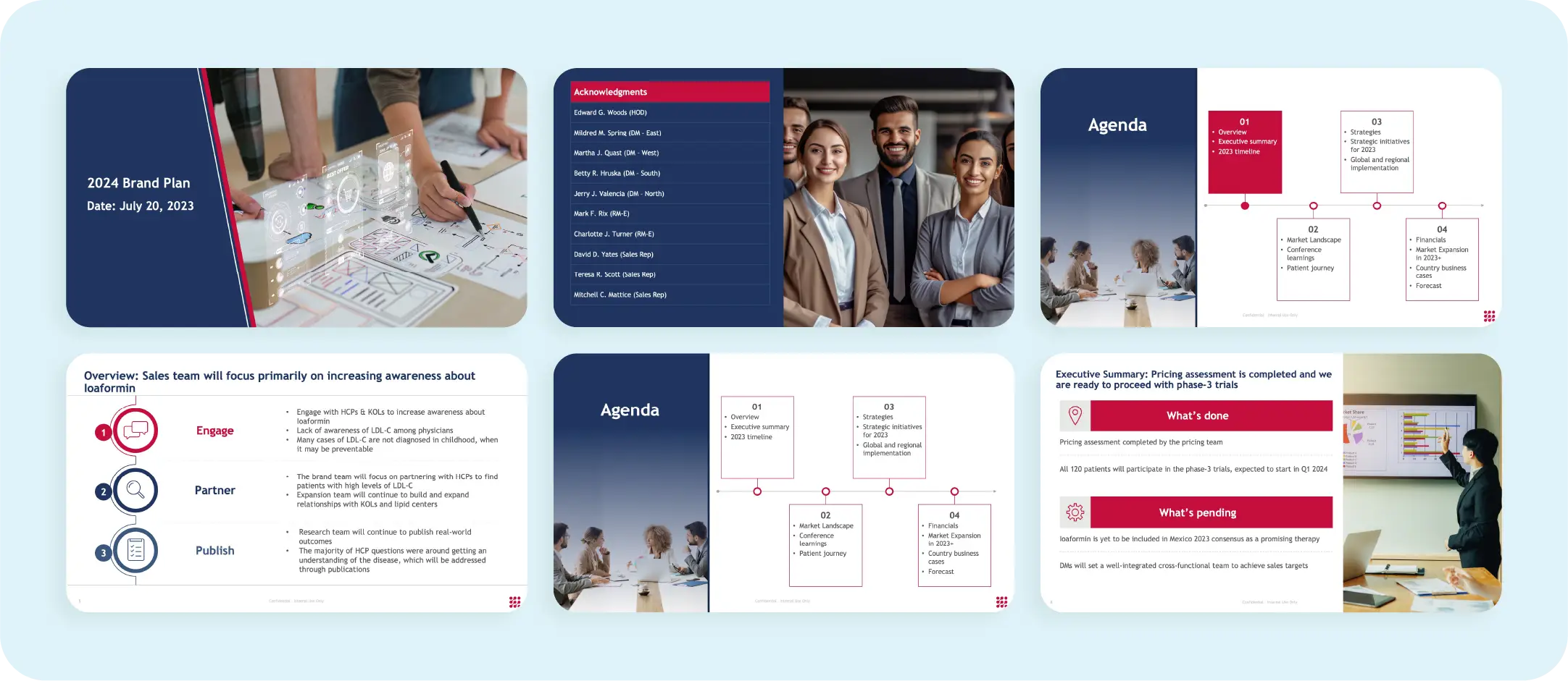
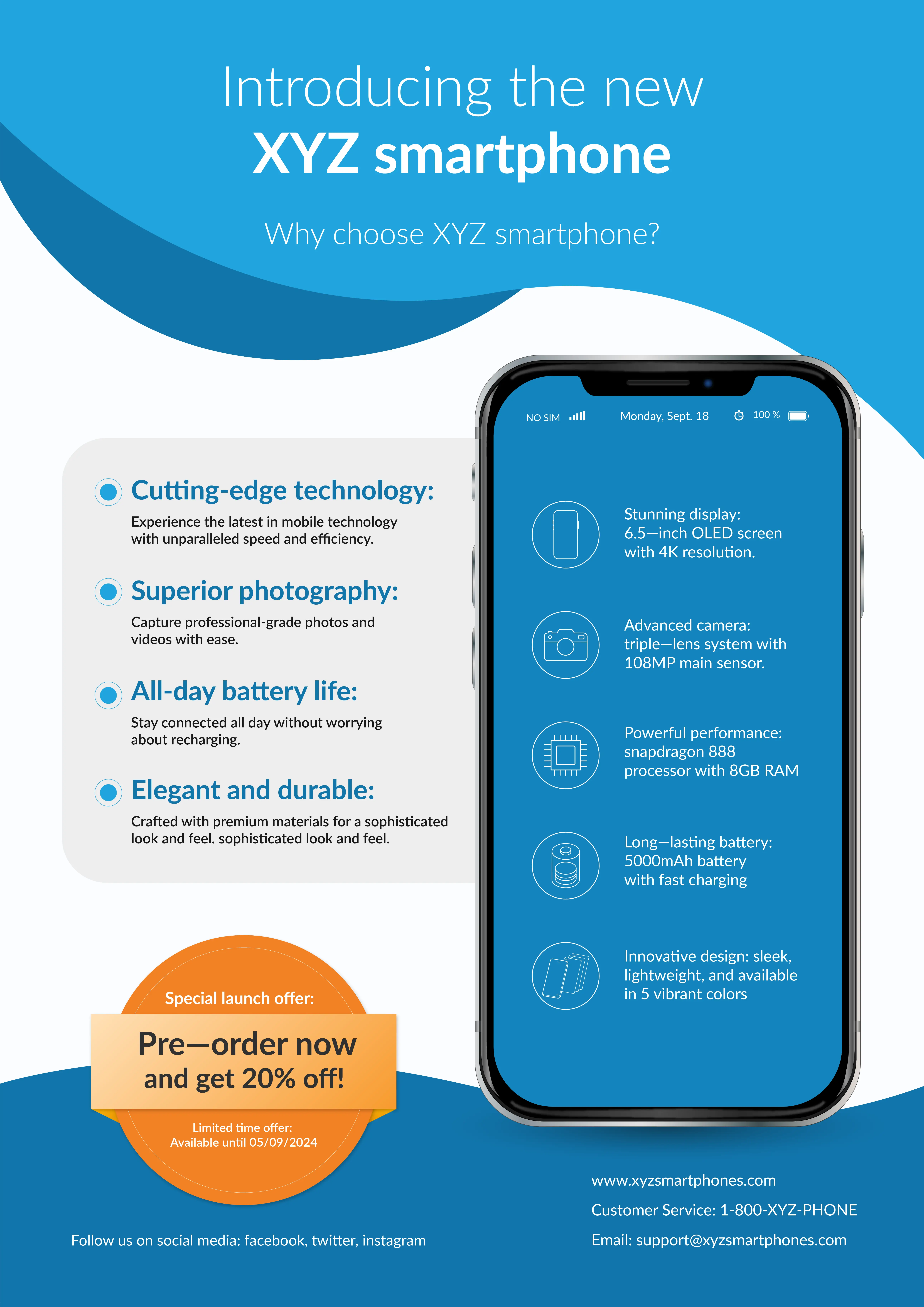
Slides or multimedia presentations are commonly used formats that allow you to organize your content systematically. They provide cues as you go along, helping you stay on track. Use presentation slides to display bullet points, images, and key information in an easily digestible manner.
Below is an example of a brand plan presentation template that effectively presents a compelling brand narrative in a logical structure. It details the necessary elements of the plan without overwhelming the audience with excessive text or visual aids.
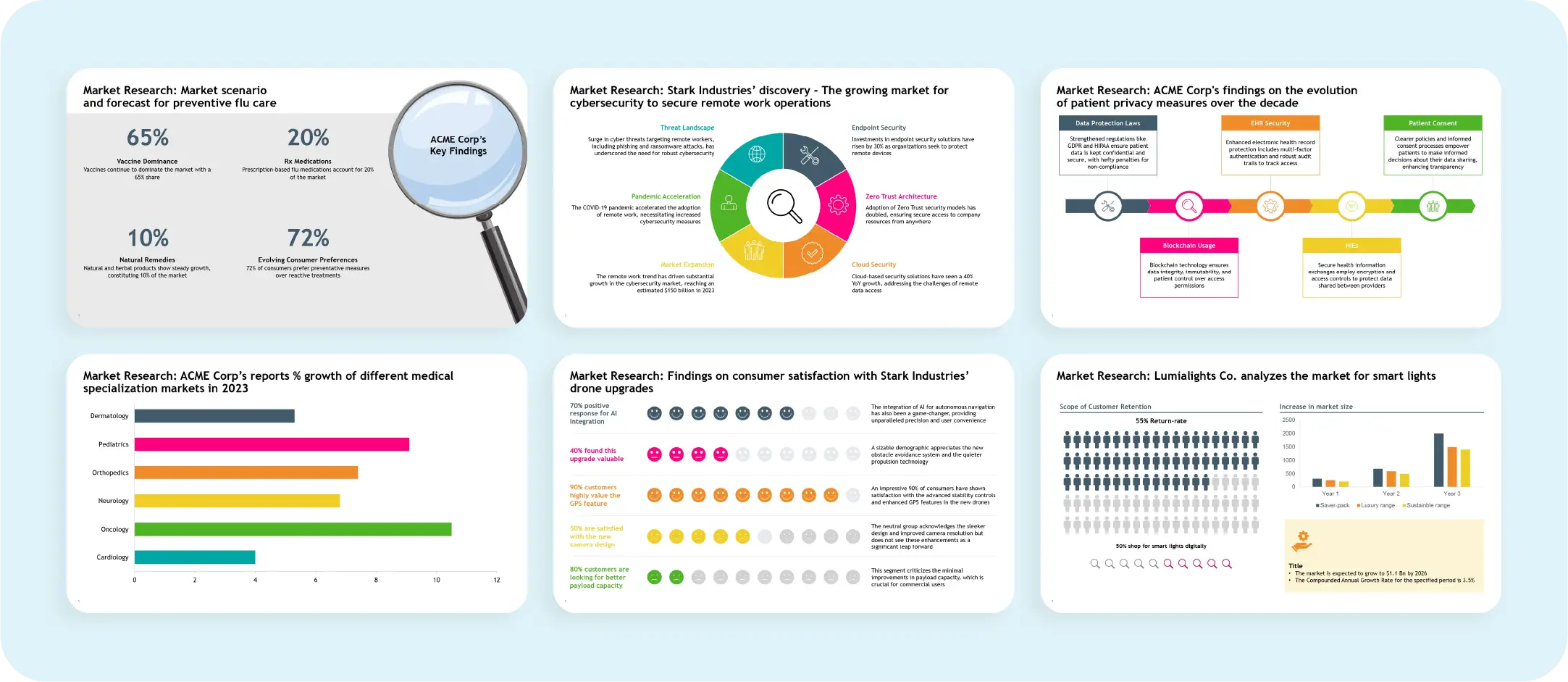
Charts and graphs are invaluable for data-heavy powerpoint presentations, as they excellently depict trends, comparisons, and data insights. Data visualization using bar charts, line graphs, pie charts, and scatter plots simplifies complex information, making it easy for the audience to understand without being overwhelmed by detailed data and numbers.
Below is an example of a market research slide template that effectively presents market research insights in an organized and visually appealing manner.
Whiteboards are ideal for informal settings and are great for explaining concepts in detail. They allow you to draw diagrams, write equations, and interact with the audience, making them especially useful for teaching or brainstorming sessions. Use this interactive presentation style the next time you are to present a quick presentation at the last minute.

Incorporating videos adds dynamism to your presentation. Videos can be used for demonstrations, testimonials, or storytelling purposes, helping to keep content concise and relevant. They engage the audience by providing visual and auditory stimulation. However, creating videos can be time-consuming and challenging, so plan accordingly to ensure high quality and relevance.
Infographics are visual tools that combine text, icons, and visuals to convey information briefly. Research shows that an infographic image is 30 times more likely to be read than a text article. Infographics simplify complex information into easy-to-understand and retainable formats. They are also engaging and memorable.
With various styles and formats available, infographics can structurally communicate a wide range of information, making them a versatile tool for any presentation.
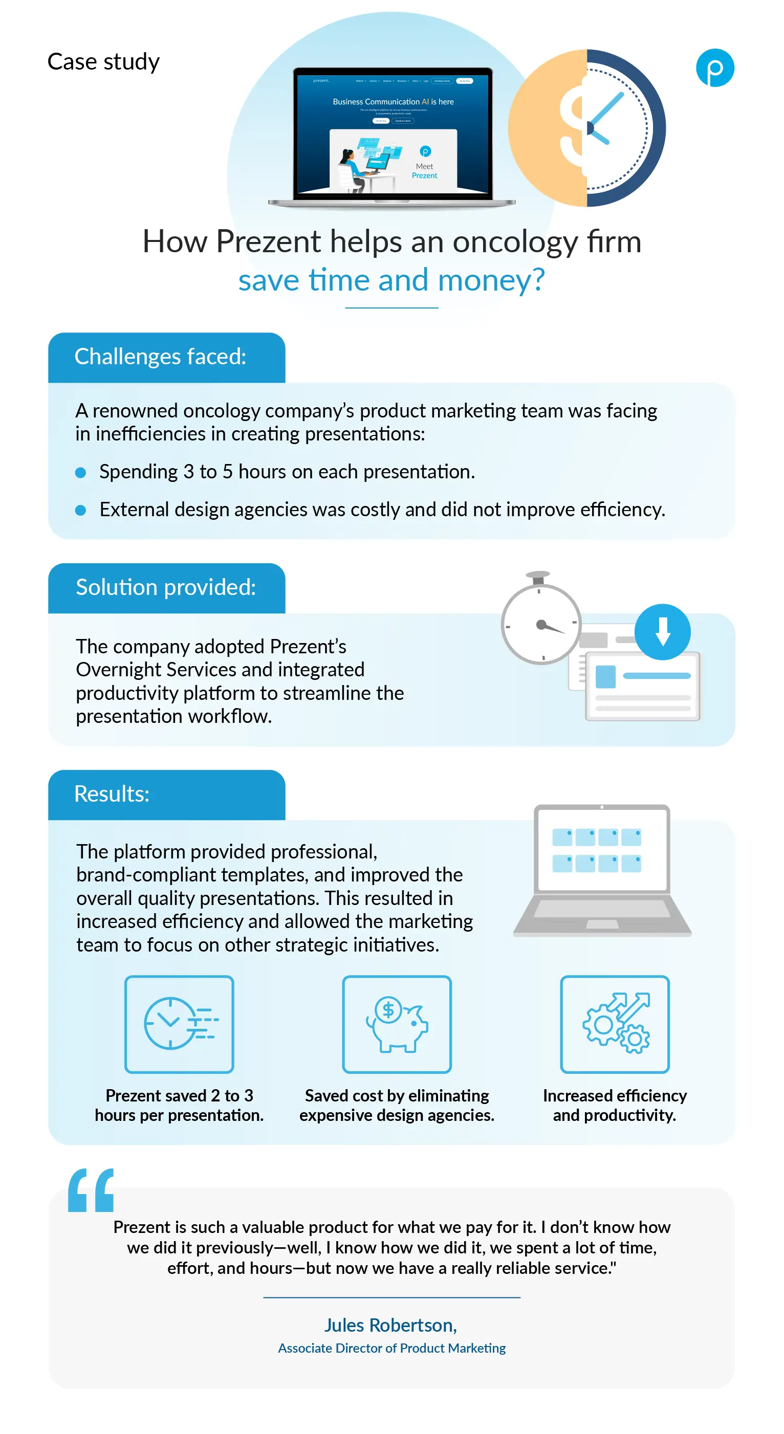
Below is an example of an infographic image of a case study depicting the challenges and solutions undertaken by a renowned oncology company to streamline its business communications. Read the full case study here.
Posters are ideal for large-scale presentations, conferences, or trade shows. They allow you to showcase information using eye-catching designs and minimal text visually. Posters can effectively highlight key points, data, and visuals concisely, drawing attention and facilitating quick understanding. They are especially useful for summarizing research findings, displaying product information, or presenting marketing messages in a visually appealing manner.
While not strictly visual during the presentation, handouts provide valuable additional information for the audience to take away. They are ideal for detailed explanations, references, or resources. For example, you can distribute handouts with supplementary data and reports to help stakeholders make well-informed decisions when presenting survey results. Handouts ensure that the audience can access comprehensive information even after the presentation.
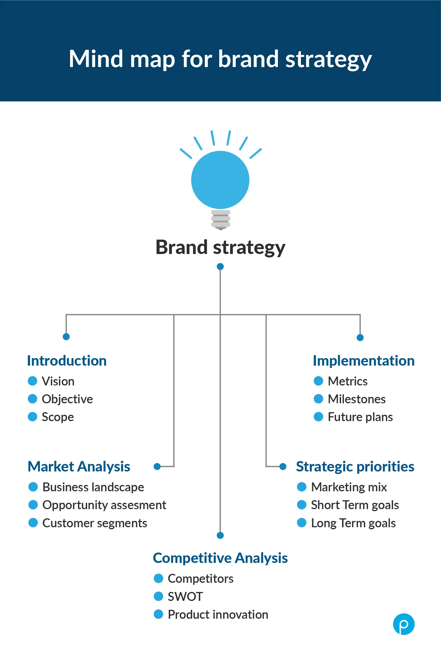
Mind maps are highly effective for problem-solving, brainstorming, note-taking, and planning. They visualize concepts, problems, and plans, facilitating a clear understanding of the topic or theme. Mind maps encourage creativity and critical thinking by organizing thoughts and breaking down complex information into a structured, easy-to-follow, and visually appealing format. As a versatile presentation tool, they enhance audience engagement and comprehension.
Creating an impactful visual presentation requires more than just a good design; it demands careful planning and execution to ensure your message is clear, engaging, and memorable. Adhering to best practices can captivate your audience and effectively convey your message. Here are some essential tips to consider:
When it comes to visual aids, less is often more. Keep things simple and relevant, using minimal text and fewer slides. Short titles make your slides look clean and boost readability. The goal is to avoid distractions so your audience stays focused on your message. High-resolution images and videos can elevate the look and feel of your presentation. Remember, overcrowded slides with too many images can be overwhelming.
Simple and easy-to-read fonts are your best friends. Pairing contrasting colors for text and backgrounds enhances readability. Think about using dark backgrounds with highlighted fonts and keeping proper margins. Consistency in your font styles, sizes, and colors throughout the presentation creates a professional and cohesive look.
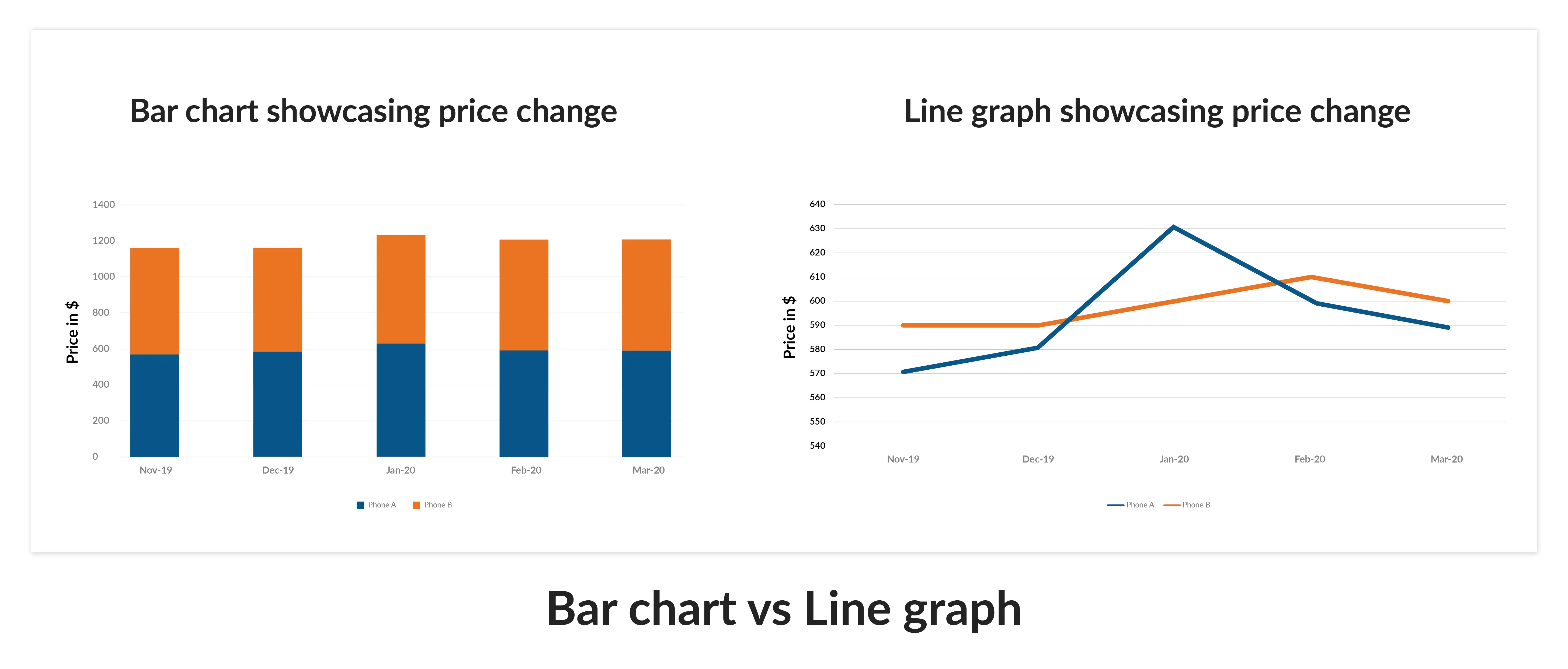
Data visualization is a powerful tool, but choosing the right type of chart or graph is essential. Bar charts, line graphs, pie charts, and scatter plots serve different purposes. Bar charts are great for comparisons, while line graphs are perfect for showing trends over time. The key is to present data clearly without clutter.
For example, a line graph clearly visualizes price changes for two phone brands over a period, making it easier to understand trends and seasonal patterns at a glance. In contrast, a bar graph fails to convey the continuous nature of the data effectively.
Engaging your audience through visual storytelling can make a huge difference. Organize your slides logically, guiding your audience from an introduction through development to a conclusion. Use visuals to support your narrative and wrap up with a visually impactful slide that reinforces your main message. This approach keeps your audience interested and makes your presentation memorable.
Feedback is crucial. Collect it to gauge how effective your presentation was. Look at metrics like audience engagement and, for online presentations, click-through rates. Assess whether you met your goals and pinpoint areas for improvement. Use this feedback to refine your presentations continuously.
Presentation software, such as Prezent, Microsoft PowerPoint, and Google Slides, enables users to create visually engaging presentations. These tools offer features like templates, animation, and real-time collaboration, making it easier to design good presentations that capture the audience's attention and effectively communicate complex data.
Good visual design enhances a presentation by organizing content with visual hierarchy, using great visual elements like charts and infographics, and adding elements like animation. This approach evokes interest and helps convey complex concepts clearly, resulting in a more effective presentation.
The six major types of visual presentations include slides, charts and graphs, whiteboards, videos, infographics, and posters. Each type offers unique advantages and can be combined to create a visual presentation that captures the audience’s attention and effectively communicates the presentation’s message.
To create engaging presentations, keep your slides simple, use high-quality stock photos and designed presentation templates, and add a bit of animation or video presentation elements. These practices help maintain the audience’s attention and enhance their understanding of the content.
To design a great presentation, try to use minimal text and clear, effective visuals like a pro. Prioritize simplicity, choose appropriate data widgets, and ensure a cohesive visual style. Utilize the template library for a range of visual options and share it with your audience for feedback to improve the entire presentation.
Prezent is a smart business communication platform powered by AI that helps you create effective powerpoint presentations in 50% less time. The following features assist you in crafting presentations with compelling visual aids quickly:
All the features of Prezent ensure that your presentations are brand-aligned and consistent without you spending hours editing slides. Find out more about Prezent and other powerful tools that can make presentation creation simple, easy, and effective by scheduling a demo. You can also explore the platform yourself by signing up for a free trial.
.webp)
Supriya is a Content Strategist and Creator at Prezent AI with extensive experience in brand storytelling, digital strategy, and B2B content. She has worked across SaaS and technology-driven businesses, building content engines that drive awareness, engagement, and pipeline growth. Passionate about crafting clear, insight-led narratives, Supriya focuses on turning complex ideas into compelling stories that resonate with modern business audiences. You can connect with her on LinkedIn.